
Candlestick Pattern – Part 1
One of the key ideas behind technical analysis is the belief that history tends to repeat itself. This principle forms the backbone of many technical analysis strategies, including candlestick pattern recognition.
Candlestick charts are a powerful technical analysis tool that condenses data from multiple time frames into a single price bar. This makes them more informative than traditional OHLC (open, high, low, close) bars or simple line charts that just connect closing prices. The beauty of candlesticks lies in their ability to form patterns, which can signal potential price movements. Plus, the use of color coding adds clarity and depth to this tool, which has its origins in 18th-century Japanese rice trading.
Typically, candlestick charts are most effective when used on a daily timeframe, as each candle encapsulates an entire day’s worth of market activity—news, data, and price action. This makes them especially valuable for longer-term or swing traders who are looking to capture trends over days or weeks.
The most fascinating aspect of candlesticks is that each candle tells a story. Think of it as a battle between buyers and sellers:
- A light candle (green or white, depending on the chart settings) shows that buyers have won the day, pushing the price higher.
- A dark candle (red or black) reveals that sellers had the upper hand, driving the price lower.
What happens between the opening and closing price—along with the highs and lows during the session—creates the candlestick’s shape, which makes this tool so compelling for traders. It’s this ongoing struggle between buyers and sellers that gives candlestick charts their rich insights into market dynamics.
History tends to repeat itself” — but we’ve refined this assumption by introducing the concept of factors that influence outcomes. When it comes to candlestick patterns, they can be broadly categorised into two types: single candlestick patterns and multiple candlestick patterns. To effectively use these patterns, there are three key principles you should keep in mind, By following these principles, you can better interpret and leverage candlestick patterns in your analysis.:
- Buy strength, sell weakness – Always align your trades with the direction of the market’s momentum.
- Be flexible – quantify and verify – Patterns aren’t rigid rules. Interpret them with context, and always validate with supporting data.
- Look for a prior trend – Candlestick patterns are most meaningful when preceded by a clear trend.

Candlestick Components
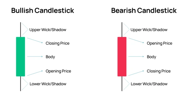
The four components of a candlestick pattern are the open, close, high, and low prices for a specific time period. Below is an example of a daily candle:
- Open – The first trade during the period specified by the candle
- High – The highest traded price
- Low – The lowest traded price
- Close – The last trade during the period specified by the candle
Let’s Analyse Candlestick Chart
The body of a candlestick basically represents the opening and closing prices of a stock during a specific time period, making it a crucial element in candlestick trading. At a glance, traders can identify the price range for that period and, based on the body’s colour, determine whether the stock price is rising or falling. For example, in a daily candlestick chart for a month, if you see a series of consecutive red candles, it signals that the stock price is consistently falling.
Above and below the body are vertical lines called wicks or shadows, which indicate the stock’s high and low prices for that period. Here’s how wicks can provide insight:
- A short upper wick on a red candle suggests that the stock opened near the high of the day.
- A short upper wick on a green candle implies that the stock closed near the high of the day.
In essence, a candlestick graph offers a complete snapshot of the stock’s price movement, showing the high, low, opening, and closing prices. The length and colour of the body (red or green) and the length of the shadows (long or short) collectively reflect market sentiment toward the stock. Understanding these details is essential for reading and interpreting candlestick charts effectively.
1. The Spinning Top
The spinning top is a fascinating candlestick pattern. It doesn’t provide clear signals for specific entry or exit points. However, it offers valuable insights into the current market situation, which traders can use to strategically position themselves. A spinning top has a distinct appearance. Picture the candle below—what stands out to you about its structure? Notice how the body is relatively small, sitting roughly in the middle of long upper and lower wicks. This structure reflects indecision in the market, where neither buyers nor sellers have gained a decisive advantage.
By understanding the story behind the spinning top, traders can interpret the market’s hesitation and plan their next move accordingly. Further we can categorize it in 2 parts:
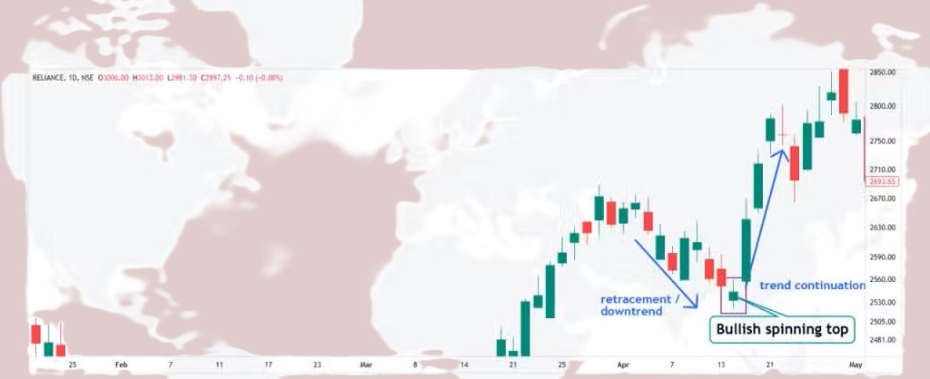
A: Bullish Spinning Top:
The bullish spinning top is a candlestick pattern that reflects significant indecision and volatility during a trading session. It forms when there’s a wide gap between the day’s high and low prices, but the open and close remain close to each other. This suggests a tug-of-war between bulls and bears, with neither side gaining a clear upper hand. However, it can signal a potential shift in sentiment from bearish to bullish.
A bullish spinning top candlestick pattern signals a potential reversal from a downtrend to an uptrend. While the price fluctuates significantly during the session, creating long wicks on both the upper and lower sides, the candle’s open and close prices remain close to each other. This structure reflects indecision in the market, with neither buyers nor sellers taking control, but it hints at a possible shift toward bullish momentum.
Interestingly, research by the Technical Analysis Research & Education (TARE) Foundation in their study, “The Predictive Power of Candlestick Patterns in Financial Markets,” found that the bullish spinning top has a 54% success rate in predicting bullish reversals. While not a guarantee, it’s a pattern worth noting for traders looking to spot potential market turnarounds.
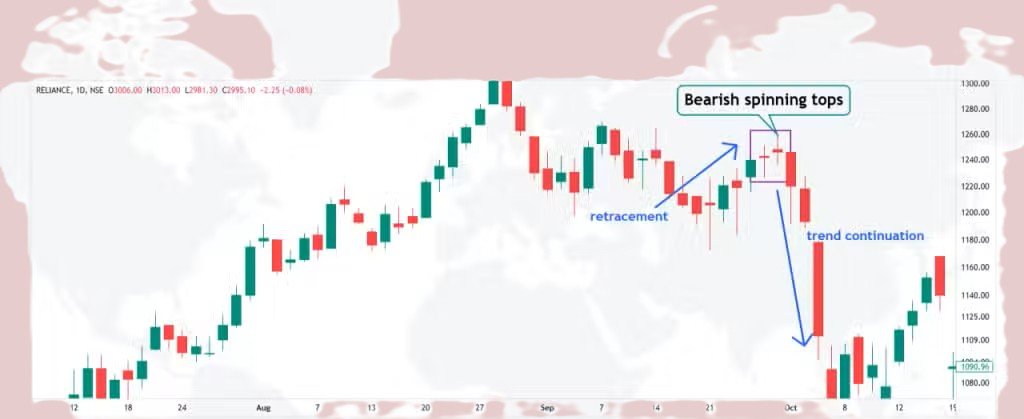
B: Bearish Spinning Top:
The bearish spinning top candlestick pattern forms during periods of significant market indecision and volatility, much like the bullish spinning top. It occurs when there’s a wide range between the high and low prices, but the open and close prices are nearly the same, signaling that neither buyers nor sellers dominated the session. This pattern often points to a potential shift in market sentiment from bullish to bearish.
In the study “Candlestick Patterns and Their Predictive Power” published in the International Journal of Financial Studies by Dr. Robert Engle and colleagues, the bearish spinning top was found to have a 53% success rate in forecasting bearish reversals. While it’s not a guarantee, it provides traders with a useful signal to consider in their analysis.
2. Shooting Star
A shooting star candlestick is a chart pattern that occurs when a security’s price rises significantly after the market opens but then drops back near the opening price by the time the market closes. This pattern is easy to recognize: it has a small body, a long upper shadow (or wick) that shows strong buying pressure early on, and a short lower shadow that indicates the subsequent price drop. The shooting star is often seen as a signal that the market might be transitioning into a bearish trend, where prices begin to decline. However, traders typically look at the next two or three candlesticks to confirm this trend before taking action.
In technical analysis, shooting star patterns are commonly used to anticipate upcoming bearish trends. The price drop signifies that sellers have gained control over the market. To trade effectively using shooting stars, traders focus on three key steps: identifying the right entry point, setting a stop-loss to manage risk, and deciding on a target profit. It’s also common for traders to wait for confirmation from subsequent candlesticks before making moves such as selling or shorting, ensuring that the pattern indicates a sustained decline.
The shooting star has its pros and cons. Its main advantages are that it’s easy to spot, simple to understand, and helpful for identifying potential price reversals. However, it has its drawbacks—it can sometimes give false signals, and it requires confirmation from additional candlestick patterns for reliability.


Leave a Reply